Big Doesn’t Have to Be Boring: Add Refinement to Commercial Building Construction
Functionality is always the first requirement for any building design. But form is just important. In commercial building construction— and large-scale tilt-wall buildings, in particular—esthetic considerations are often minimized. But even in this realm, limitless opportunities exist for innovation and creative excellence.
A company’s physical presence is an important part of its brand image. A building should reflect the company’s values, status, purpose and priorities. That involves more than simply erecting signage with the company’s logo out front. Every facet of a company’s premises should contribute to branding cohesiveness—from the shape and layout of the building to the colors and even the landscaping.
Although there’s often natural tension between form and function, when things are working right, they are inseparable. Legendary architect Richard Buckminster Fuller expressed it well: “When I am working on a problem, I never think about beauty. I only think about how to solve the problem. But when I have finished, if the solution isn’t beautiful, I know it is wrong.”
It’s Not Just a Building—It’s an Experience
These esthetic factors form the overall experience for people entering a company’s physical space. A well-designed building not only contributes to the customer’s overall brand impression; it also enhances the morale of those who work at the same location every day.
How does the environment make people feel?
The visitor’s experience is influenced by things like ease of use, as well as more ineffable factors like balance and openness. Design choices such as floor plan, lighting, and materials selection may affect people on more of a subconscious than conscious level, but they are still critically important.
Achieving the optimal effect calls for creative thinking. The Fleming Construction Group confronted such a challenge in working with the Don Thornton Auto Group, which operates several of the most prestigious luxury car dealerships in Oklahoma. The company’s elegant image demanded architecture to match. The goal was to create a modern, people-friendly ambience that would make visitors feel both comfortable and elated.
The project architects went to work and came up with three (to-date) building designs to meet the challenge: Lexus of Tulsa, Audi of Tulsa, and Land Rover of Tulsa. Because it was important to highlight the distinctive character of each dealership, all three designs are utterly unique.
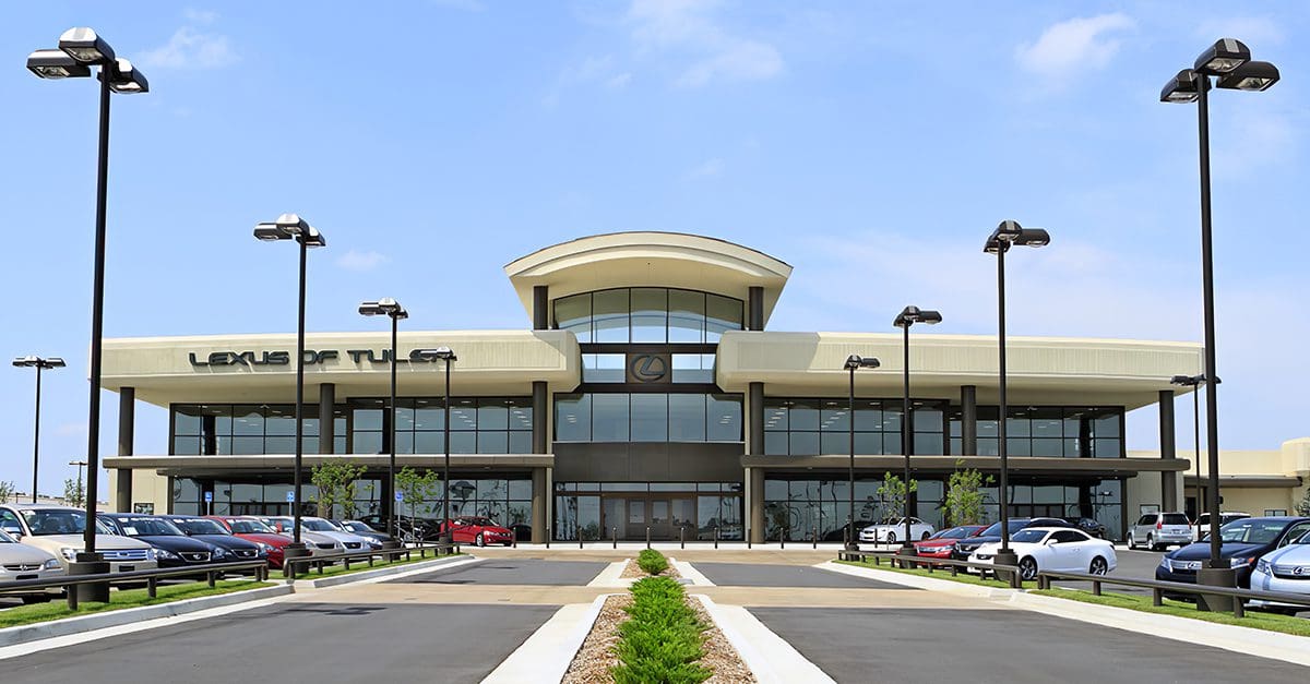
The Lexus of Tulsa facility is a 90,000-square-foot steel and concrete value-engineered building that welcomes visitors with a stately “eyebrow” covered atrium as they approach on the beautifully landscaped drive. Inside, visitors can stroll on imported Mediterranean porcelain tile and enjoy the natural sunlight streaming from overhead skylights.
Most traditional car dealership layouts include a glitzy showroom to impress customers, while the other departments—service, parts and cashier—are often drearily functional. The new Lexus of Tulsa site deliberately departs from that formula. In keeping with its modern, welcoming approach, the dealership offers visitors an internet café, a workout room and a children’s area (because, after all, Lexus buyers have kids too).
If Auto Dealerships Can Be Beautiful—So Can Warehouses
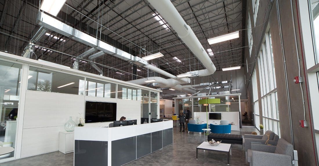
The features we’ve described may seem sensible for auto dealerships and other retail establishments hoping to attract a discerning, upscale clientele. But the same innovative approach can also be applied successfully to non-consumer-facing businesses. Warehouses and industrial sites often welcome customers and other important visitors. So, they too must pay attention to the impression their physical facilities convey. And employees certainly benefit from working in a pleasant, well-planned environment.
The rise of online marketing has affected nearly every aspect of life in America—and construction design is no exception. As brick-and-mortar retail gives way to internet-based commerce, we’ve seen colonies of big-box construction sprouting on the edges of many cities. Additionally, international supply-chain constraints are forcing manufacturers to bring inventory production and warehousing stateside. This change is creating a further need for large-scale concrete-tilt and pre-engineered metal buildings. For these buildings, the design is often spartan and nondescript; from the outside, they can appear identical to their neighbors.
In other words, they’re boring.
But it doesn’t have to be that way.
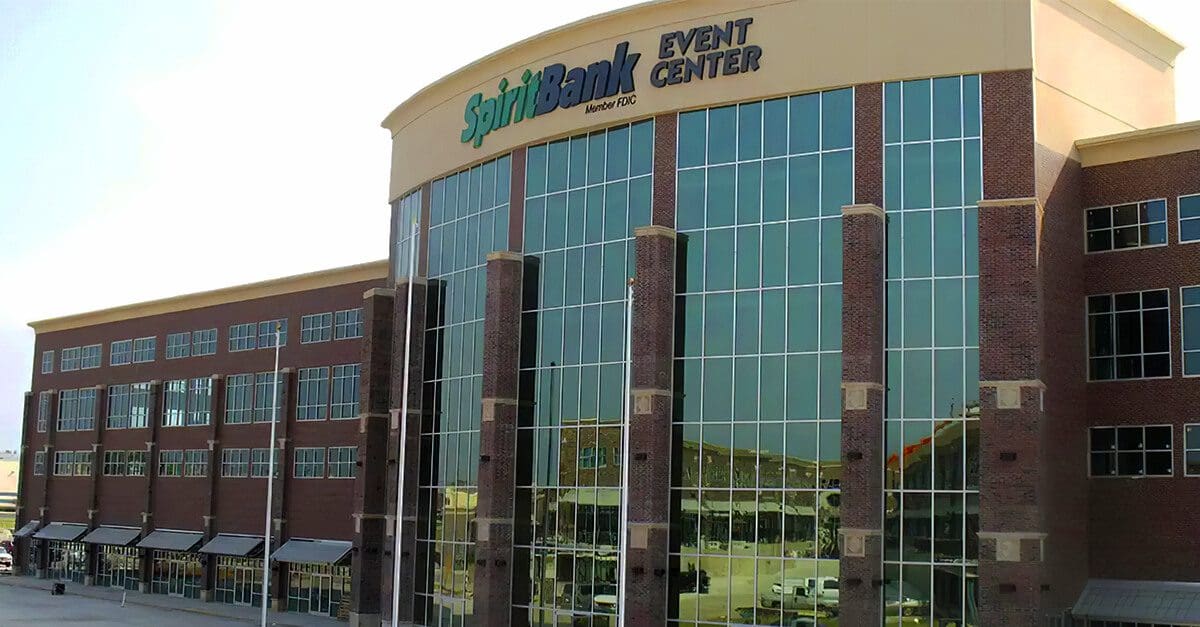
Concrete tilt-up buildings can be made more appealing with the addition of some creative design features. A thoughtful approach can challenge expectations and bring an element of surprise to the most utilitarian structures.
Start with color: a warehouse doesn’t have to be concrete gray. A tasteful hue, perhaps on alternating panels, can differentiate it from its neighbors.
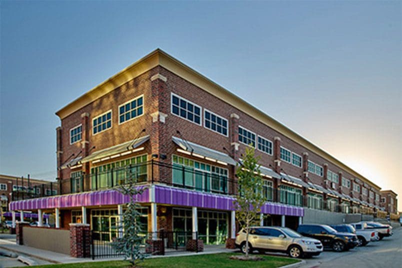
Livening up the façade with different materials can also be a cost-effective way to distinguish an otherwise unremarkable structure. For example, the Regal Plaza and Convention Center in Bixby, Oklahoma utilized NichihaⓇ brick facade to customize the exterior and give the look of a classic downtown shopping center.
People respond well to shapes and textures that evoke the natural world. The best modern interior design emphasizes openness and contact with natural elements. Traditionally, warehouses and industrial spaces lack windows. But the presence of natural light can make a world of difference. One study by Alan Hedge, a professor in the Department of Design and Environmental Analysis at Cornell, correlated the presence of natural light to worker satisfaction and productivity. The findings showed that optimal natural light had dramatic positive effects on workers’ health, satisfaction and productivity.
Aiming for Excellence in Commercial Building Construction
Bringing beauty and harmony into a physical environment pays off in a multitude of ways. It can enhance a company’s relationship with customers, investors, and other important parties. But it can also make a big difference for another all-important constituency—the employees.
At Fleming Construction Group, achieving design excellence is what makes our work exciting. We’re eager to share our ideas and expertise—to bring wholesome, functional work environments to more and more people and enterprises.
The professionals at FCG are experts at large building construction. Find out more:
Read This Next:

